Book thursday night. You have a seat in the hall. Consider it a christmas treat! ;-)
EEEEEEEEEKS! REALLY???? but where did the seat come from?i thought they're all sold out?o_0
It came upon a midnight clear, while shepherds watched their sheep at night. Joy to the world!
YAAAAAAY!you didn't sacrifice a seat or something right?o_o
Every gift is a sacrifice. this season we remember the sacrifice of sacrifices; He who was born to die, whose light was extinguished that ours may burn evermore.
SO christmasily poetic.o_o thank you so so so so so much!i so wanted to go! T_T
* * *
hwei. woozy. says (11:23 PM):
eh guess what
roomie just handed me something that came in the mail addressed to me
Seladang says (11:24 PM):
wah
hwei. woozy. says (11:24 PM):
greeting cards from the mouth & foot painting artists
they said i'm under no obligation to buy, but my purchase would make a difference
and and and and and
guess how much the set is?
Seladang says (11:26 PM):
ah, how much?
hwei. woozy. says (11:26 PM):
RM35!
the same as the preview ticket
ahaha
Seladang says (11:28 PM):
wah
it is a sig
*sign
as you have received, so freely give
hwei. woozy. says (11:29 PM):
yalor
so signful
i shall, i shall
Seladang says (11:32 PM):
hahaha
you see
you put 'G' for God into 'sinful'
and you get 'siGnful'
ah, this is the incarnation
hwei. woozy. says (11:33 PM):
wah
it's a day of inspiration
haha!
Seladang says (11:33 PM):
indeed!
Wednesday, December 29, 2010
Monday, December 27, 2010
White Wine in the Sun
Tim Minchin's 'White Wine in the Sun'.
An 'agnostic' Christmas song, and probably one of the best songs I've heard in a while.
* * *
Lyrics (from here):
I, I really like Christmas
It’s sentimental I know, but I just really like it
I’m, I’m hardly religious
I’d rather break bread with Dawkins than Desmond Tutu to be honest
And yes I have all of the usual objections to consumerism
The commercialisation of an ancient religion
And the western-isation of a dead Palestinian
Press-ganged into selling PlayStations and beer
But I still really like it.
I’m looking forward to Christmas
Though I’m not expecting a visit from Jesus
I’ll be seeing my dad
My brother and sisters, my gran and my mum
They’ll be drinking white wine in the sun
I’ll be seeing my dad
My sisters and brother, my gran and my mum
We’ll be drinking white wine in the sun.
I don’t go for ancient wisdom
I don’t believe just ’cause ideas are tenacious it means that they’re worthy
I get freaked out by churches
Some of the hymns that they sing have nice chords but the lyrics are dodgy
And yes I have all of the usual objections
To the mis-education of children forced into a cult institution
And taught to externalise blame
And to feel ashamed
And to judge things as plain right and wrong
But I quite like the songs.
I’m not expecting big presents
The old combination of socks, jocks and chocolate is just fine by me.
‘Cause I’ll be seeing my dad
My brother and sisters, my gran and my mum
They’ll be drinking white wine in the sun
I’ll be seeing my dad
My sisters and brother, my gran and my mum
They’ll be drinking white wine in the sun.
And you my baby girl
My jetlagged infant daughter
You’ll be handed round the room
Like a puppy at a primary school
And you’re too young to know
But you will learn yourself one day
That wherever you are and whatever you face
These are the people who’ll make you feel safe in this world
My sweet blue-eyed girl
And if my baby girl
When you’re twenty-one or thirty-one
And Christmas comes around
And you find yourself nine thousand miles from home
You’ll know whatever comes
Your brother and sister, and me and your mum
Will be waiting for you in the sun
Girl, when Christmas comes
Your brothers and sisters, your aunts and your uncles
Your grandparents, cousins, and me and your mum
Will be drinking white wine in the sun
We’ll be waiting for you in the sun
Baby, whenever you come
We’ll be drinking white wine in the sun
Waiting.
I, I really like Christmas
It’s sentimental I know.
Sunday, December 26, 2010
Tables and Chairs
Sivin, Rev Wolfgang and Judith. 'The Baptism-Driven Life', 27 May 2005.
I remember when BLC was but a few tables and chairs
When Uncle Long was able and there were
Only thirty of us on a Sunday morning;
When prayer in the church’s wings was a carpeted affair
Amongst guitars and keyboard, bass and drums—
The hum of cars pulling up into the compound
The sound of shoes and sandals untied at the threshold
Of holy ground.
Though small in number, we grew steadily in members,
The fastest-growing church in the city;
That is, the fastest-growing church—biologically!
I must’ve been the only teen (a sprightly lad of seventeen)
In a pool of uncles and aunties,
Little boys and girls, and some barely babies,
And of course, the ‘young at heart’.
Today the crosses stare from left and right
But they were always there, albeit out of sight;
One had to navigate the sofas on one side
And the library on the other—
(There were some good books, if one would bother to take a look.)
And then the kitchen, and the table laden
With nothing short of a scrumptious feast
And I would be reminded of the Table which welcomes
Without prejudice, the greatest and the least.
All this was not quite so long ago, back when
The only sign to lead a visitor in
Was a rickety board which read, “The Father’s House”
That led some to speculate if this was some new cult or sect.
I would do it again, would set down the world and its tempting voice
For another evening caught in the storm, mapping out life;
The darker those days, the brighter the candles shone
And the Father would walk with us till we could walk on our own
(Which, would, in all honesty, be not quite yet).
Still, we’re set, and at least a little resolute
To jump with neither landing pad nor parachute;
With only a little faith flung high up in the air,
That we may resume the work that was begun
(The work which may take us anywhere)
The work of the Son whom we have met
Even in a carpeted room with no more than a few tables and chairs.
* * *
With thanks to SooT for the biological observation.
First published in the Mustard Seed, Christmas 2010 edition. The last line, 'Even in a carpeted room...' should only appear at the very end, and not at the end of the fourth stanza.
Tuesday, December 21, 2010
Of Ben, Tim and Yen in 2008
In looking through old photos to search for something for a friend, I practically walked through many moments of my life in campus since my first year in 2007. There isn't enough time now to relive each of those memories, but I found a particular sequence of photos somewhat arresting.
Here are two photos from that sequence:
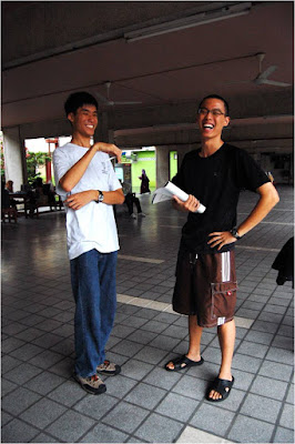
We happened to be around at the Arts Fac at the same time, and Yen was there too. She put us through some poses to demonstrate something she was working on for one of her classes. (This was back when she was Yen Yen the second-year undergraduate, and not Miss Leong as she is addressed today.)
They were taken on Tim's D40 (before he'd acquired his permanent Tamron 17-50mm lens), I think, by Yen.
This was nearly one year before Tim and I would be walking along corridors of a higher power, and quite some time before Dataran Sastera became what it is today. This was also Tim's pre-Crocs era, and back when I was wearing my Timberland shoes, which I now eschew in favour of the simplicity of Hush Puppies and 'kampung adidas'.
But some things haven't changed. Tim is still frequently seen in that same pair of shorts, and I still wear those jeans, albeit faded after all the wear-and-tear.
How much changes in over two-and-a-half years? So much, and yet also, very little!
A Cocktail a Day
Aunty Daphne and Jonathan spent most of last week here with the family.
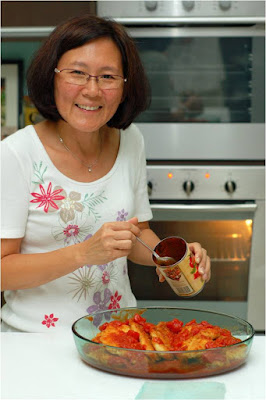
On Thursday evening, the day before they returned home, she made her special Parmesan Chicken for us.
Every night of the week she was here, I made a cocktail. In some ways, this sustained the momentum built during the LAB Tour (more on that to come!) of the previous weekend.
A tall drink made by building.
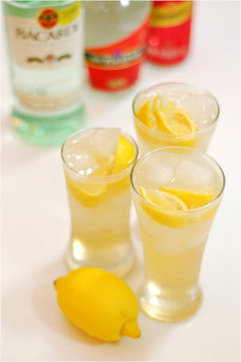
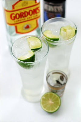
2 measures Bacardi white
1/2 measure triple sec
Juice of 1/2 lemon
4 measures ginger ale
Spent shell of 1/2 lemon to garnish
Add lemon juice to highball with ice. Drop in spent shell and add the rest of the ingredients.
The traditional Margarita was named after the actress Marjorie King, who was a guest at Danny Herrera's Rancho La Gloria in Tijuana in 1948, where he discovered that she was allergic to every spirit except tequila.
I made a variation on the usual lime version by using lemon instead.
2 measures tequila
1 1/4 measures triple sec
3/4 measures lemon juice
lemon wedge
Rim the glass with salt. Shake the lime juice, triple sec and tequila, and strain. Garnish with a wedge of lemon.
First made circa 1893 in Shoemakers Restaurant in Washington, D.C., for Joe 'Colonel Jim' Rickey, a Congressional lobbyist from Kentucky.
A Rickey can be made using any spirit as its base.
2 measures gin
Juice of 1 lime
4 measures soda water
Squeeze the juice of the lime into a highball and drop the spent lime shell in. Add gin and stir, then top up with soda water.
A drink that evokes the bright textiles of Madras.
Because I inadvertently fell asleep early on Thursday night, I made this as a breakfast cocktail shortly before Aunty Daphne's departure on Friday.
1 measure vodka
2 measures cranberry juice
2 measures orange juice
Pour orange juice, cranberry juice and vodka into highball, and stir.
All cocktail recipes and descriptions from Maria Costantino's The Cocktail Handbook, with minor variations to suit taste. Photographs original.
On Thursday evening, the day before they returned home, she made her special Parmesan Chicken for us.
Every night of the week she was here, I made a cocktail. In some ways, this sustained the momentum built during the LAB Tour (more on that to come!) of the previous weekend.
* * *
Tuesday: Bacardi Buck
A tall drink made by building.
2 measures Bacardi white
1/2 measure triple sec
Juice of 1/2 lemon
4 measures ginger ale
Spent shell of 1/2 lemon to garnish
Add lemon juice to highball with ice. Drop in spent shell and add the rest of the ingredients.
Wednesday: Lemon Margarita
The traditional Margarita was named after the actress Marjorie King, who was a guest at Danny Herrera's Rancho La Gloria in Tijuana in 1948, where he discovered that she was allergic to every spirit except tequila.
I made a variation on the usual lime version by using lemon instead.
2 measures tequila
1 1/4 measures triple sec
3/4 measures lemon juice
lemon wedge
Rim the glass with salt. Shake the lime juice, triple sec and tequila, and strain. Garnish with a wedge of lemon.
Thursday: Gin Rickey
First made circa 1893 in Shoemakers Restaurant in Washington, D.C., for Joe 'Colonel Jim' Rickey, a Congressional lobbyist from Kentucky.
A Rickey can be made using any spirit as its base.
2 measures gin
Juice of 1 lime
4 measures soda water
Squeeze the juice of the lime into a highball and drop the spent lime shell in. Add gin and stir, then top up with soda water.
Friday: Madras
A drink that evokes the bright textiles of Madras.
Because I inadvertently fell asleep early on Thursday night, I made this as a breakfast cocktail shortly before Aunty Daphne's departure on Friday.
1 measure vodka
2 measures cranberry juice
2 measures orange juice
Pour orange juice, cranberry juice and vodka into highball, and stir.
* * *
All cocktail recipes and descriptions from Maria Costantino's The Cocktail Handbook, with minor variations to suit taste. Photographs original.
Monday, December 20, 2010
Walking Bukit Bintang
It was a pleasant 3 November evening with Leanne, Steph and Aloysius in the heart of KL. The weather was surprisingly fair and clear, and the roads (well, just one actually!) very walkable.
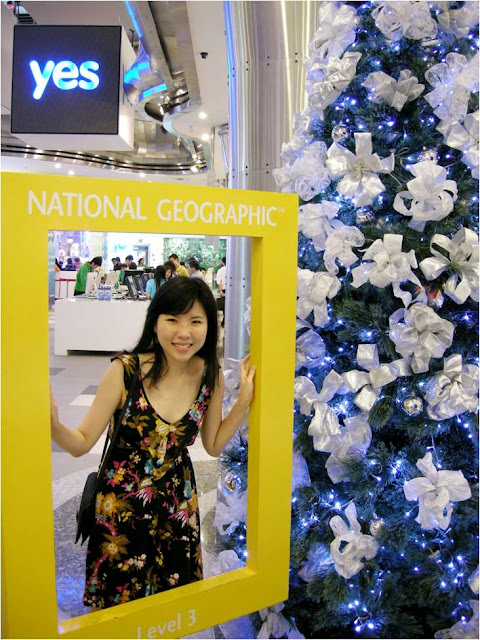
Leanne and I spent some time hanging out in Lot 10 while waiting for Steph and Aloysius. We visited the Apple and NG stores, and dropped by Guardian. YTL's presence was strongly felt, with their new 'YES' 3G/wireless service complementing the mall's Christmas décor.
We also visited Fahrenheit 88; it was my first time at the new place, which was once KL Plaza. Remember when it was called Mun Loong, anyone?
It has occurred to me, over the first two weeks of December, that photography is a deviation from reality.
While photography encompasses 'realistic' styles like those employed for nature and journalism, as well as 'fantastic' styles like those used in lomography, pop art and some types of portraiture, the very elements used to achieve impact in photography deviate from how the eye perceives things.
I am talking about things like long exposures, shallow depth-of-field, creative flash and motion blur. These are some of many techniques used by photographers to convey emotions, and even truths, about the world around them.
But that's photography, isn't it? The usage of unrealistic methods to describe something realistically. I can't overquote John Sexton when he says, "It's so bizarre to me that I can show you a picture that's black-and-white and you somehow think it represents reality. When's the last time you opened a window and it was black and white outdoors?"
(The full interview here.)
Leanne and I spent some time hanging out in Lot 10 while waiting for Steph and Aloysius. We visited the Apple and NG stores, and dropped by Guardian. YTL's presence was strongly felt, with their new 'YES' 3G/wireless service complementing the mall's Christmas décor.
We also visited Fahrenheit 88; it was my first time at the new place, which was once KL Plaza. Remember when it was called Mun Loong, anyone?
Next on National Geographic.
Fahrenheit 88.
Cabbie taking a shot of Fahrenheit 88.
The simple but elegant lobby at Hotel Piccolo.
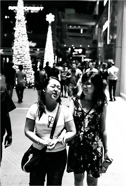
Leanne and the Christmas tree, Piccolo lobby.
I'm not sure if every egg dreams of being cracked over a griddle, fried and flung into gastric juices, but it is extremely difficult to fault the McDonald's advertising campaigns!
Jalan Bukit Bintang.
Steph and Aloysius outside Tarbush, where we had dinner.
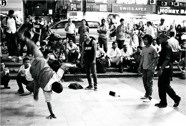
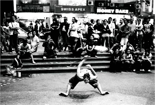
Breakdancers.
Breakdancers again.
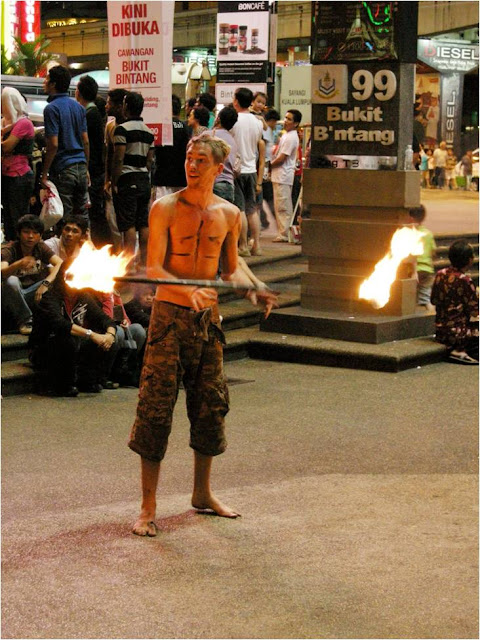
The fire-swirling Mat Salleh.
The fire-swirling Mat Salleh in action.
1Malaysia and the photographer.
Steph and Leanne on the plaza outside the Pavilion.
* * *
It has occurred to me, over the first two weeks of December, that photography is a deviation from reality.
While photography encompasses 'realistic' styles like those employed for nature and journalism, as well as 'fantastic' styles like those used in lomography, pop art and some types of portraiture, the very elements used to achieve impact in photography deviate from how the eye perceives things.
I am talking about things like long exposures, shallow depth-of-field, creative flash and motion blur. These are some of many techniques used by photographers to convey emotions, and even truths, about the world around them.
But that's photography, isn't it? The usage of unrealistic methods to describe something realistically. I can't overquote John Sexton when he says, "It's so bizarre to me that I can show you a picture that's black-and-white and you somehow think it represents reality. When's the last time you opened a window and it was black and white outdoors?"
(The full interview here.)
Wednesday, December 15, 2010
Wordled
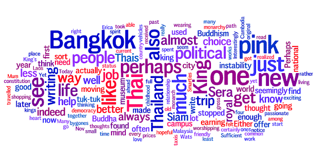
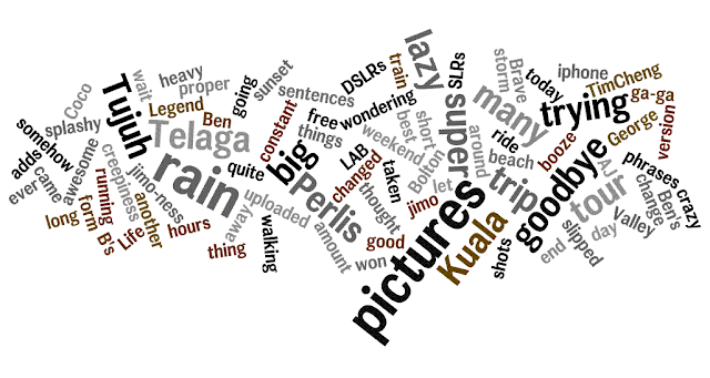
So Tse Hwei 'wordled' my blog. Read about it here.
As she describes it:
"It's this thing that analyzes a text, then generates a word cloud, with the words appearing more frequently generated larger than the rest."
If I may add, I think it also prioritises recent posts over older ones.
Here's my blog, wordled by Hwei:
For fun, I did one on Yen's blog:
Ai Wei's:
And Jia Hui's:
(Strangely enough, I somehow remember hearing about this quite some time ago. Strange sense of déjà vu.)
Tanjong Pagar
For Tien Li
Nightlights, waterfront, speedboat
Lights dim, recede from the rim of water and land
Whether on promontory or out in an island.
In a culture of organised statements and thoughts
Where civilisation becomes civil.
A sense of adventure
An element of the unknown
Where am I to be in obedience to Christ?
The thinking involved, the independence
Not just on Sunday morning, but a decision we must make continuously.
To be a good doctor, a good dancer
This still is the focal point
Whereupon, turning around with head spinning
You focus on a spot.
What is this imagery--
Here comes a dreamer
(But I will show him how much he must suffer)
What is this imaginary--
The Master sends, but he has already gone ahead.
To bear these tests, to be the best even when the situation is not the best.
Where danger and opportunity meet
In crisis, the door open to complete
What was begun, ere day is done.
Keep the robe not for a special occasion
But wear it every day
Use these gifts without exception
Or watch them die away.
The heart with nothing to love becomes unloving
The one, not used to forgiving, becomes unforgiving
As cold water turns to ice, frozen and never moving.
Shall you reign because you enclose yourself in cedar?
Take on me, take me on
Look out for the "a-ha" moment
But it doesn’t come; you are dry on inspiration.
Pen and pencil,
Stencil to trace the shape of the road ahead.
A boy dams a river, a sliver of hope
That water won’t just rush through,
Flowing into stillness, in the absence of motion
Still flowing—the water a bed for life.
(November 2010)
Thursday, December 09, 2010
Ektar 100 Preview
Film is dying, and yet film giants Fujifilm and Kodak have in recent years, well into the digital age, launched new and reintroduced film stocks.
Fujifilm re-engineered their classic Velvia (1990-2005) using an up-to-date film base, and re-released it in 2007 as Velvia 50 due to popular demand. Digital could not, and still cannot, come close to approximating Velvia.
Kodak's latest product (besides Portra 400, which is more of a revision and update than a new film stock proper) is Ektar 100, launched in September 2008. The original Ektar was introduced in 1989 with ISO ratings of 25, 125 (later 100) and 1000, and then discontinued in 1994. The new emulsion, while bearing the name of its predecessor, was not designed to be a perfect copy as Velvia 50 was.
Ektar 100 is touted to be, among other things, exceptional for scanning and digitising. It is also claimed to have the highest saturation of any Kodak print film available today, as well as the smoothest and finest grain, making it suitable for enlarging. (More from Kodak here.)
I got my first five rolls from B&H, collecting them from the UPS facility in Honolulu the day before leaving for the Big Island. It was the first film I shot on the Big Island, and to date I have finished some seven or eight rolls.
Of course, all the promotional fluff is meaningless if the film does not perform well as a film to begin with; there is no point hanging a wonderful enlargement of a lousy photograph. And as far as films are concerned, the main areas of concern are colour reproduction, performance under various lighting conditions and dynamic range.
It was the 69th anniversary of the Pearl Harbor bombing two days ago, and what better way to commemorate the occasion than to show how Ektar performed on the U.S.S. Missouri in Pearl Harbor itself!
In the shots above, Ektar performs relatively well in daylight; but so do most print films. Instead, I was impressed by the pictures of the Captain's Cabin and the Library. The warm light inside the Captain's Cabin was well-balanced with the cooler early afternoon light on the outside, maintaining white balance in spite of different colour temperatures.
In the Library picture, the red chair cushions, yellow signboard and brown index card cabinet were reproduced with good saturation and colour fidelity in spite of the fluorescent lighting.
Let's see how Ektar 100 performs under a variety of lighting conditions.
What follows are pairs of photos taken in fluorescent, overcast, shade and sulfur lamp light, respectively.
As can be seen, Ektar 100 handles fluorescent, especially warm fluorescent, light very well. Colours are vivid and true-to-life, and the textures are pleasant. In fact, the room looks more pleasant and welcoming than I actually remember it!
Under overcast conditions, the overall image is less flattering, but colours remain punchy and saturated. The lalang, for instance, was practically drab and colourless when I shot it.
Ektar 100 seems to perform best in shade on warm days, where the light is warm enough to allow the saturated colours to come through without looking unnatural. Suit Lin's turquoise tank top contrasts with the orange doors, and the salad looks tempting!
I once thought these atrocities were weaknesses owned only by slide films. Apparently not! Sulphur lamps seem to produce light which is too cool and 'green' for Ektar 100 to manage. Of course, this can be remedied using photo-editing software, but the process is laborious.
Let's see how Ektar 100 stacks up against Portra 160VC (which I recently blogged, and raved, about) and digital capture.
Of the three, Ektar's colours are the least lifelike, while digital is the warmest. However, I like the textures of Portra best. Ektar has once again been trumped by the green sulphur lamps high up on the roof of the station, while digital has taken on a somewhat yellowish tint.
On the other hand, Portra most closely resembles what I saw on the platform, albeit a little less warm.
Roger and Frances describe Ektar 100 here as follows:
It's incredibly rewarding if you use it properly, and quite close to a disaster if you don't. Think of it as a negative film with the latitude of slide film, and it's rewarding: depending on exposure, you can choose anything from soft, pastel colours (minimum exposure) to rich, saturated colours.
That Ektar 100 behaves as a print film with slide-like qualities does not come as a surprise, as slide films Velvia and Provia are also abysmal performers under sulphur lamps.
It seems the one thing consistent about colour films, especially colour slide films, is that they require careful lighting. They are not as flexible as digital. But when you get the light right, they perform very well. Take Velvia; it has a very narrow dynamic range, extremely high saturation, and won't perform well in any but the finest light.
You see, it's difficult to get conditions right for films like Velvia, but when those conditions are right, no other film, and certainly no digital processor, comes close to matching it.
I've barely shot enough to arrive at the final word on Ektar 100; it seems to be the sort of film that can be suited to a variety of applications if the photographer knows what he/she is doing. And so I shall experiment a little more with it and see if I can get it to surprise me even further.
Langkawi, here we come!
Fujifilm re-engineered their classic Velvia (1990-2005) using an up-to-date film base, and re-released it in 2007 as Velvia 50 due to popular demand. Digital could not, and still cannot, come close to approximating Velvia.
Kodak's latest product (besides Portra 400, which is more of a revision and update than a new film stock proper) is Ektar 100, launched in September 2008. The original Ektar was introduced in 1989 with ISO ratings of 25, 125 (later 100) and 1000, and then discontinued in 1994. The new emulsion, while bearing the name of its predecessor, was not designed to be a perfect copy as Velvia 50 was.
Ektar 100 is touted to be, among other things, exceptional for scanning and digitising. It is also claimed to have the highest saturation of any Kodak print film available today, as well as the smoothest and finest grain, making it suitable for enlarging. (More from Kodak here.)
I got my first five rolls from B&H, collecting them from the UPS facility in Honolulu the day before leaving for the Big Island. It was the first film I shot on the Big Island, and to date I have finished some seven or eight rolls.
* * *
Of course, all the promotional fluff is meaningless if the film does not perform well as a film to begin with; there is no point hanging a wonderful enlargement of a lousy photograph. And as far as films are concerned, the main areas of concern are colour reproduction, performance under various lighting conditions and dynamic range.
It was the 69th anniversary of the Pearl Harbor bombing two days ago, and what better way to commemorate the occasion than to show how Ektar performed on the U.S.S. Missouri in Pearl Harbor itself!
Stars and Stripes.
The Captain's Cabin.
View of the U.S.S. Arizona Memorial, Pearl Harbor and Honolulu from atop the U.S.S. Missouri.
Piao, Ben, Nasha, Tawin and Renzo. Photo by the U.S.S. Missouri crew guy.
Site of a kamikaze attack on deck.
The ship's library.
In the shots above, Ektar performs relatively well in daylight; but so do most print films. Instead, I was impressed by the pictures of the Captain's Cabin and the Library. The warm light inside the Captain's Cabin was well-balanced with the cooler early afternoon light on the outside, maintaining white balance in spite of different colour temperatures.
In the Library picture, the red chair cushions, yellow signboard and brown index card cabinet were reproduced with good saturation and colour fidelity in spite of the fluorescent lighting.
* * *
Let's see how Ektar 100 performs under a variety of lighting conditions.
What follows are pairs of photos taken in fluorescent, overcast, shade and sulfur lamp light, respectively.
Maria Ivanova, Woodrow Wilson Center, Washington, D.C.
Lunch, Woodrow Wilson Center, Washington, D.C.
As can be seen, Ektar 100 handles fluorescent, especially warm fluorescent, light very well. Colours are vivid and true-to-life, and the textures are pleasant. In fact, the room looks more pleasant and welcoming than I actually remember it!
Lalang, Pologround at Taman Sultan Azlan Shah, Ipoh.
Joy, Pologround at Taman Sultan Azlan Shah, Ipoh.
Suit Lin, Physics Lab at the abandoned school, Ipoh.
Greens, Pahala Plantations manager's house, Ka'u, Big Island of Hawai'i.
Ektar 100 seems to perform best in shade on warm days, where the light is warm enough to allow the saturated colours to come through without looking unnatural. Suit Lin's turquoise tank top contrasts with the orange doors, and the salad looks tempting!
Family on Hari Raya Eve, Taiping Railway Station.
Adrian, Ruth, Emily Chow and George, Ferry to Penang.
I once thought these atrocities were weaknesses owned only by slide films. Apparently not! Sulphur lamps seem to produce light which is too cool and 'green' for Ektar 100 to manage. Of course, this can be remedied using photo-editing software, but the process is laborious.
* * *
Let's see how Ektar 100 stacks up against Portra 160VC (which I recently blogged, and raved, about) and digital capture.
Ektar 100.
Portra 160VC.
Digital, Nikon D50.
Of the three, Ektar's colours are the least lifelike, while digital is the warmest. However, I like the textures of Portra best. Ektar has once again been trumped by the green sulphur lamps high up on the roof of the station, while digital has taken on a somewhat yellowish tint.
On the other hand, Portra most closely resembles what I saw on the platform, albeit a little less warm.
* * *
Roger and Frances describe Ektar 100 here as follows:
It's incredibly rewarding if you use it properly, and quite close to a disaster if you don't. Think of it as a negative film with the latitude of slide film, and it's rewarding: depending on exposure, you can choose anything from soft, pastel colours (minimum exposure) to rich, saturated colours.
That Ektar 100 behaves as a print film with slide-like qualities does not come as a surprise, as slide films Velvia and Provia are also abysmal performers under sulphur lamps.
It seems the one thing consistent about colour films, especially colour slide films, is that they require careful lighting. They are not as flexible as digital. But when you get the light right, they perform very well. Take Velvia; it has a very narrow dynamic range, extremely high saturation, and won't perform well in any but the finest light.
You see, it's difficult to get conditions right for films like Velvia, but when those conditions are right, no other film, and certainly no digital processor, comes close to matching it.
I've barely shot enough to arrive at the final word on Ektar 100; it seems to be the sort of film that can be suited to a variety of applications if the photographer knows what he/she is doing. And so I shall experiment a little more with it and see if I can get it to surprise me even further.
Langkawi, here we come!
Thursday, December 02, 2010
A little colour in a bland day
It's been one of those days.
The disappointment after driving through the morning jam. (Nonetheless, it was still the Eucharist.)
The (uncalled for) anger and short-temperedness.
Walking out at lunch.
Deciding to forego something I had looked forward to over the last few days.
(I did enjoy the morning, though. Playing 'Jerusalem' on the piano, sorting out those old books and remembering where it all began.)
* * *
I called it the 'max-confusion' point. It's not really a breaking point, but it's a point where everything is just swirling around too fast and too wildly for any of it to make any sense.
Yet in the midst of all this...
A very kind and thoughtful gesture. It was given as a lunch gift; I am about to have it for dinner.
And then when I got home, I saw this:
Shipped much faster and much more efficiently than it did to Hawai'i back in late May.
Film really never fails.
It never fails photographically, and it never fails to brighten up a gloomy day.
Friday, November 26, 2010
Love Renewed
Love never dies; it lives on
And on, in other forms--
Transfigured, as night to dawn
Away from expectation and norms;
Love changes and is changed
As riverbed gives way to water's plying hands
Into order as are stars arranged,
River missing from the earth, from clouds returning
As rain upon the land.
(7.00 p.m., 25 Nov at PJ Hills.)
Thursday, November 25, 2010
Twelve for Pleasantly Pastelly Portrait-Perfect PORTRA
Ever since starting out with film in late 2007, I have focused primarily on black-and-white and slide film. Print/negative film, on the other hand, has been a different story.
While it can be argued that the results of slide and BW film cannot be replicated digitally, it would appear that print film (the sort we grew up with) cannot rival digital. Locally, there are not many professional print films on the market (besides some like Fuji Reala, a roll of which I shot last year in Sungai Pisang here), and we have to make do with commercial films like Kodak Ultramax 400, Kodak Gold 200 and Fuji X-tra 400.
When I went to the States, I did not bring my D50 with me simply because I wanted to limit my shots, lessen the burden on my hard disk, and also bring back photos which would potentially have better survival value than JPEG files. I opted for much consumer film because slide film was expensive, hard to find and tricky to expose. But in between I shot a number of rolls of the well-known Kodak Portra 160 (not available in Malaysia, so I was quite excited when I placed the order prior to leaving for the States) and the new, but promising, Kodak Ektar 100.
I returned with extra rolls of each in tow, and having shot quite a bit of Portra now in some six different places/circumstances, I am convinced of its near-flawless versatality and can see why it has been an enduring favourite. What follows are twelve Portra pictures which, I hope, demonstrate this unique quality.
* * *
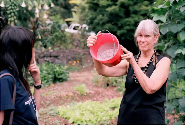
One: Nancy Redfeather, Kawanui Farm, Hawai'i.
Nancy Redfeather shows us her home-made fertiliser (I think this was a calcium fertiliser derived from bones) while Kant Kaw looks on.
I like how the film has rendered good skin tones, while keeping the pail and plants sufficiently red and green, respectively. Velvia would have brilliantly saturated the pail and the greens, but also given Redfeather's skin a nice, red roasting.
Two: Kitchen door, Kawanui Farm, Hawai'i.
A sidelit shot of slippers, shoes and sandals outside the Redfeathers' home.
A simple, straightforward shot, but I like the nuanced earth tones and beautiful dynamic range; shadows not too dark, and highlights not burnt out. Digital would suffer with the former, while slide film would fall short at the latter.
Three: ‘Ōhi‘a tree, Volcanoes National Park, Hawai'i.
This was taken near the Jaggar Museum, on the side facing Mauna Loa, the highest mountain on earth by base elevation. It can be seen in the background, behind land cleared for cattle ranching, a threat to forests in Hawai'i.
While the obvious choice for landscapes is slide film, especially stock like Velvia, I like the pastel colours here: the gentle, dreamy sky and the soft earth tones - all this while keeping the saturation brilliantly high on the red O'hia flowers. I can only imagine Astia doing this better.
Four: Thurston Lava Tube, Volcanoes National Park, Hawai'i.
This is where we exited the lava tube, a cavelike underground channel through which lava once flowed, but hollowed when the lave drained out.
It was a long exposure using a fisheye lens, and I'm impressed by the dynamic range captured. The textures on the walls of the lava tube are also really something. At first I did not like the idea of the man standing there, fiddling with his camera. But he stood still long enough to actually become an asset to the photograph, providing a sense of scale as Mun Siong did in this shot.
Five: Kīlauea Iki Crater
Another fisheye shot, this time with the scorching afternoon sun in the frame, and Tawin in the foreground for good measure.
Amazing dynamic range! The sun maintains its brilliance without burning out the sky for the foreground, or over-darkening the foreground for the sky.
Six: Ben, Experimental Theatre, University of Malaya.
This picture was shot by Adrian with the 11-16mm lens on the day of my Convocation.
I like the beautifully saturated sky and pink balloon, and the angle gives this creeper-covered face of the ET a sense of grandeur. Lens shot at 16mm to keep vignetting to a minimum.
Seven: Ruth Vinoth, PJ Gospel Hall.
Picture taken during the annual PKV Convo Dinner, before the event proper began.
A simple, straightforward shot, but given that the room was fluorescent-lit, the film did an impeccable job of retaining good skin tones, warm copper on the drum set in the background, and dark red/maroon on the keyboard 'cover cloth' (on top of the piano).
Eight: Jia Hui, KL Old Railway Station.
Taken the morning we left for Ipoh, while waiting for the new KTM Electric Train. The colours might bring some 'old school' thoughts to mind.
The fluorescent light rendered somewhat greenish in this shot, but Jia Hui's skin tones are intact. One of the things I like about film (and I mentioned it in this post) is that ambient fluorescent light actually causes skin tones to stand out. When digital warms colours, it warms everything flatly.
Nine: Sleepers, Electric Train to Ipoh.
Divya and Ruth asleep as the train passed a smoking factory in the distance.
Again, another seemingly normal shot, but the luminance outside the window was signifcantly higher than the luminance in the train. Digital would have been able to balance out the light with some careful metering, but the film pulled it off effortlessly; you can never quite overexpose print film.
And now for some comparison.
Tim and I went shooting in Bagan Lalang to gather material for the Dare to Dream Challenge. He was armed with Velvia, and I, with Portra.
Father and boys, shot on Velvia 50. Note the insane blues.
Ten: Father and boys, Bagan Lalang.
The same scene, same time, but different film.
Much better skin tones, but not nearly quite as evocative as the Velvia shot. Different films for different purposes, while digital almost always looks the same.
Eleven: Leanne with bouquet and koala, Sunway Convention Centre.
Di Kor and Cassandra decked the koala in felt mortarboard, gown and matching turquoise hood.
She was my fourth official convocation subject, after Yen, Mich and Mel Phoon. While I employed BW alongside digital for my previous shoots, I decided to try Portra this time around for the family portraits (using digital for the snapshots with coursemates and friends). The results were nothing short of elegant.
Twelve: Pik Tze and Leanne, Sunway Convention Centre.
They'd just met, but trust bubbly Pik Tze to ask, and pose, for a shot with a complete stranger!
Again, I think the film did a great job on the skin tones, while giving the bounced flash a muted effect. Bounced flash on digital usually looks punchier.
* * *
In summary, I think the word that best describes Portra, is 'graceful'. While Velvia is loud and ostentatious, and Astia melancholic, Portra imparts a dignified humanity to its subjects.
Photographers are wont to stereotype films (e.g., Velvia is the 'nature' film and Astia is the 'portrait' film); even Ken Rockwell says Kodachrome is horrible for people shots due to a 'greenish cast'. In spite of this, Steve McCurry shot some of his greatest portraits on Kodachrome and I've shot some of my favourite landscapes on Astia.
So I wouldn't be too quick to pin Portra down as a 'portrait' film, as can be evidenced by its effectiveness even for landscapes. Instead, I would say that Portra is a very versatile film, and that if you were stuck with only one film for a diverse range of subjects/applications, this would probably be your best bet. If you shoot nothing but nature, Velvia may suit you; but if you anticipate a variety of subject matter and lighting conditions, such as when travelling, print films are usually more flexible than their slide relatives, and Portra is among the best print films available today.
It should be noted that Portra 160 seems best exposed at ISO 100 or 125, which means it is not a film for low light. For best effects, reserve it for the warm light of early morning and late afternoon, or use flash. Alternatively, shoot Portra 400 or 800; I've not tried them, but they should be as consistent in character as 160, if only slightly grainier.
It has been refreshing shooting at around ISO 100, being so used to digital's minimum of 200 and relatively clean 800. Shooting film has made me think more about light; we've really been spoilt by digital's high ISOs that we are often content shooting in poor light just because we can get away with it.
More information on the 160VC Portra film I shoot, here.
(Review on Kodak Ektar 100 forthcoming; I need more material!)
Subscribe to:
Comments (Atom)
