While it can be argued that the results of slide and BW film cannot be replicated digitally, it would appear that print film (the sort we grew up with) cannot rival digital. Locally, there are not many professional print films on the market (besides some like Fuji Reala, a roll of which I shot last year in Sungai Pisang here), and we have to make do with commercial films like Kodak Ultramax 400, Kodak Gold 200 and Fuji X-tra 400.
When I went to the States, I did not bring my D50 with me simply because I wanted to limit my shots, lessen the burden on my hard disk, and also bring back photos which would potentially have better survival value than JPEG files. I opted for much consumer film because slide film was expensive, hard to find and tricky to expose. But in between I shot a number of rolls of the well-known Kodak Portra 160 (not available in Malaysia, so I was quite excited when I placed the order prior to leaving for the States) and the new, but promising, Kodak Ektar 100.
I returned with extra rolls of each in tow, and having shot quite a bit of Portra now in some six different places/circumstances, I am convinced of its near-flawless versatality and can see why it has been an enduring favourite. What follows are twelve Portra pictures which, I hope, demonstrate this unique quality.
* * *
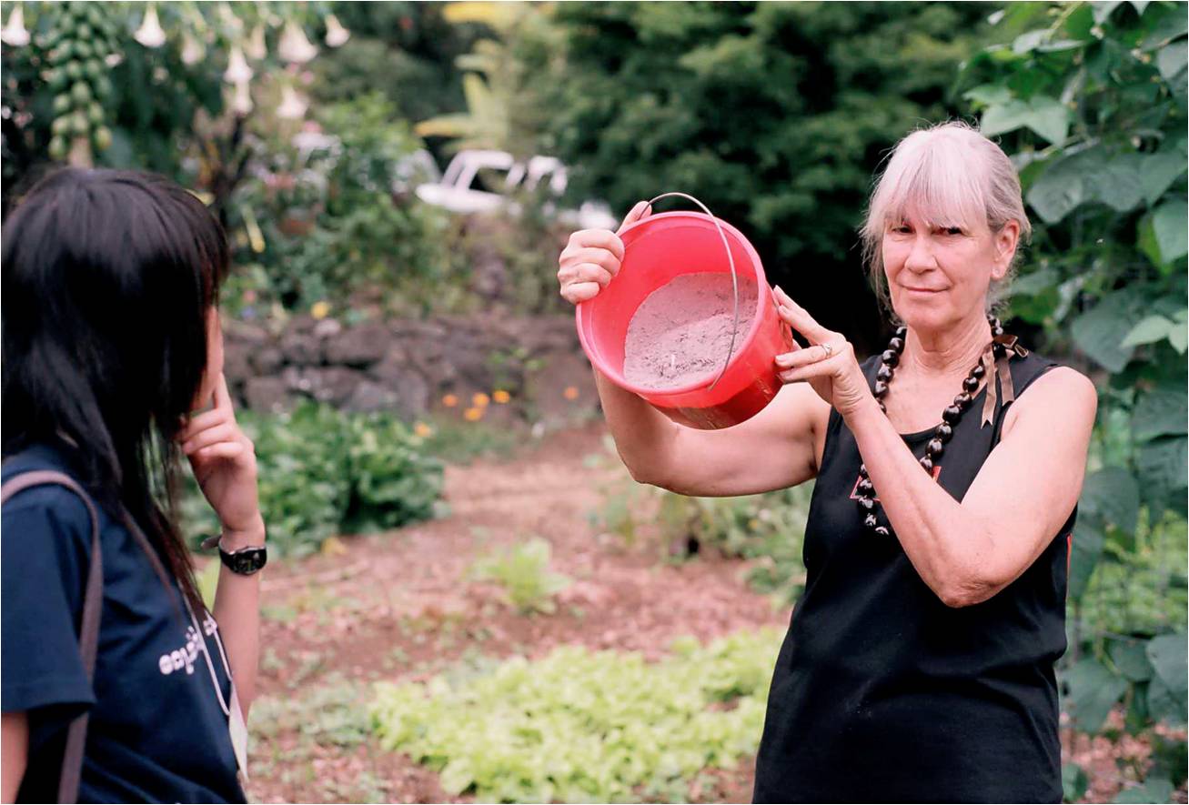
One: Nancy Redfeather, Kawanui Farm, Hawai'i.
Nancy Redfeather shows us her home-made fertiliser (I think this was a calcium fertiliser derived from bones) while Kant Kaw looks on.
I like how the film has rendered good skin tones, while keeping the pail and plants sufficiently red and green, respectively. Velvia would have brilliantly saturated the pail and the greens, but also given Redfeather's skin a nice, red roasting.

Two: Kitchen door, Kawanui Farm, Hawai'i.
A sidelit shot of slippers, shoes and sandals outside the Redfeathers' home.
A simple, straightforward shot, but I like the nuanced earth tones and beautiful dynamic range; shadows not too dark, and highlights not burnt out. Digital would suffer with the former, while slide film would fall short at the latter.

Three: ‘Ōhi‘a tree, Volcanoes National Park, Hawai'i.
This was taken near the Jaggar Museum, on the side facing Mauna Loa, the highest mountain on earth by base elevation. It can be seen in the background, behind land cleared for cattle ranching, a threat to forests in Hawai'i.
While the obvious choice for landscapes is slide film, especially stock like Velvia, I like the pastel colours here: the gentle, dreamy sky and the soft earth tones - all this while keeping the saturation brilliantly high on the red O'hia flowers. I can only imagine Astia doing this better.
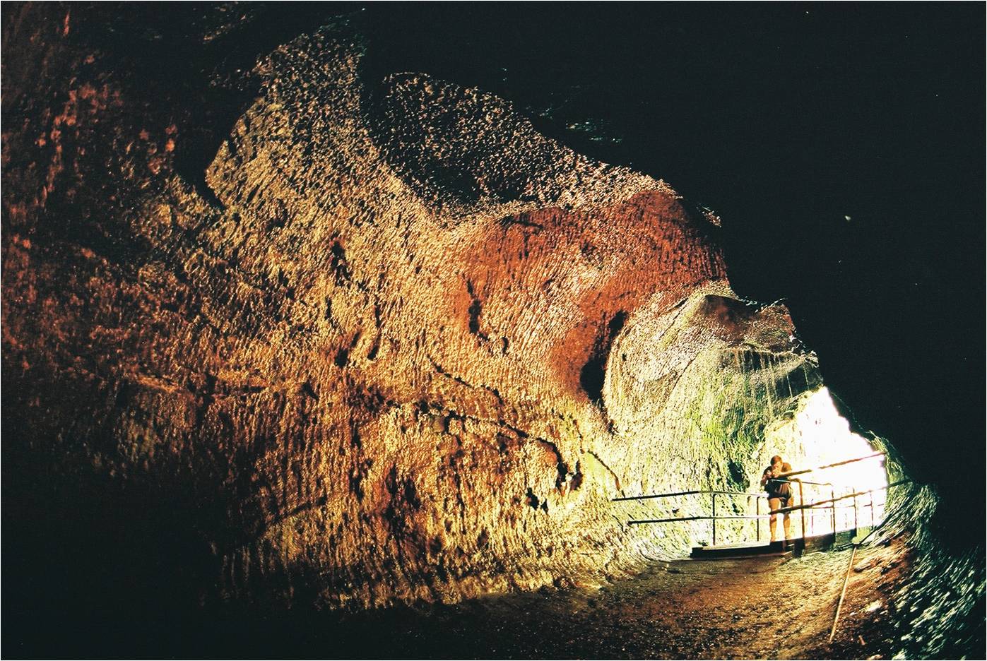
Four: Thurston Lava Tube, Volcanoes National Park, Hawai'i.
This is where we exited the lava tube, a cavelike underground channel through which lava once flowed, but hollowed when the lave drained out.
It was a long exposure using a fisheye lens, and I'm impressed by the dynamic range captured. The textures on the walls of the lava tube are also really something. At first I did not like the idea of the man standing there, fiddling with his camera. But he stood still long enough to actually become an asset to the photograph, providing a sense of scale as Mun Siong did in this shot.

Five: Kīlauea Iki Crater
Another fisheye shot, this time with the scorching afternoon sun in the frame, and Tawin in the foreground for good measure.
Amazing dynamic range! The sun maintains its brilliance without burning out the sky for the foreground, or over-darkening the foreground for the sky.

Six: Ben, Experimental Theatre, University of Malaya.
This picture was shot by Adrian with the 11-16mm lens on the day of my Convocation.
I like the beautifully saturated sky and pink balloon, and the angle gives this creeper-covered face of the ET a sense of grandeur. Lens shot at 16mm to keep vignetting to a minimum.

Seven: Ruth Vinoth, PJ Gospel Hall.
Picture taken during the annual PKV Convo Dinner, before the event proper began.
A simple, straightforward shot, but given that the room was fluorescent-lit, the film did an impeccable job of retaining good skin tones, warm copper on the drum set in the background, and dark red/maroon on the keyboard 'cover cloth' (on top of the piano).

Eight: Jia Hui, KL Old Railway Station.
Taken the morning we left for Ipoh, while waiting for the new KTM Electric Train. The colours might bring some 'old school' thoughts to mind.
The fluorescent light rendered somewhat greenish in this shot, but Jia Hui's skin tones are intact. One of the things I like about film (and I mentioned it in this post) is that ambient fluorescent light actually causes skin tones to stand out. When digital warms colours, it warms everything flatly.

Nine: Sleepers, Electric Train to Ipoh.
Divya and Ruth asleep as the train passed a smoking factory in the distance.
Again, another seemingly normal shot, but the luminance outside the window was signifcantly higher than the luminance in the train. Digital would have been able to balance out the light with some careful metering, but the film pulled it off effortlessly; you can never quite overexpose print film.
And now for some comparison.

Tim and I went shooting in Bagan Lalang to gather material for the Dare to Dream Challenge. He was armed with Velvia, and I, with Portra.

Father and boys, shot on Velvia 50. Note the insane blues.

Ten: Father and boys, Bagan Lalang.
The same scene, same time, but different film.
Much better skin tones, but not nearly quite as evocative as the Velvia shot. Different films for different purposes, while digital almost always looks the same.

Eleven: Leanne with bouquet and koala, Sunway Convention Centre.
Di Kor and Cassandra decked the koala in felt mortarboard, gown and matching turquoise hood.
She was my fourth official convocation subject, after Yen, Mich and Mel Phoon. While I employed BW alongside digital for my previous shoots, I decided to try Portra this time around for the family portraits (using digital for the snapshots with coursemates and friends). The results were nothing short of elegant.

Twelve: Pik Tze and Leanne, Sunway Convention Centre.
They'd just met, but trust bubbly Pik Tze to ask, and pose, for a shot with a complete stranger!
Again, I think the film did a great job on the skin tones, while giving the bounced flash a muted effect. Bounced flash on digital usually looks punchier.
* * *
In summary, I think the word that best describes Portra, is 'graceful'. While Velvia is loud and ostentatious, and Astia melancholic, Portra imparts a dignified humanity to its subjects.
Photographers are wont to stereotype films (e.g., Velvia is the 'nature' film and Astia is the 'portrait' film); even Ken Rockwell says Kodachrome is horrible for people shots due to a 'greenish cast'. In spite of this, Steve McCurry shot some of his greatest portraits on Kodachrome and I've shot some of my favourite landscapes on Astia.
So I wouldn't be too quick to pin Portra down as a 'portrait' film, as can be evidenced by its effectiveness even for landscapes. Instead, I would say that Portra is a very versatile film, and that if you were stuck with only one film for a diverse range of subjects/applications, this would probably be your best bet. If you shoot nothing but nature, Velvia may suit you; but if you anticipate a variety of subject matter and lighting conditions, such as when travelling, print films are usually more flexible than their slide relatives, and Portra is among the best print films available today.
It should be noted that Portra 160 seems best exposed at ISO 100 or 125, which means it is not a film for low light. For best effects, reserve it for the warm light of early morning and late afternoon, or use flash. Alternatively, shoot Portra 400 or 800; I've not tried them, but they should be as consistent in character as 160, if only slightly grainier.
It has been refreshing shooting at around ISO 100, being so used to digital's minimum of 200 and relatively clean 800. Shooting film has made me think more about light; we've really been spoilt by digital's high ISOs that we are often content shooting in poor light just because we can get away with it.
More information on the 160VC Portra film I shoot, here.
(Review on Kodak Ektar 100 forthcoming; I need more material!)
1 comment:
Hi, I would like to subscribe for this webpage to take most
up-to-date updates, therefore where can i do it please
assist.
My website; gourmet coffee beans
Post a Comment